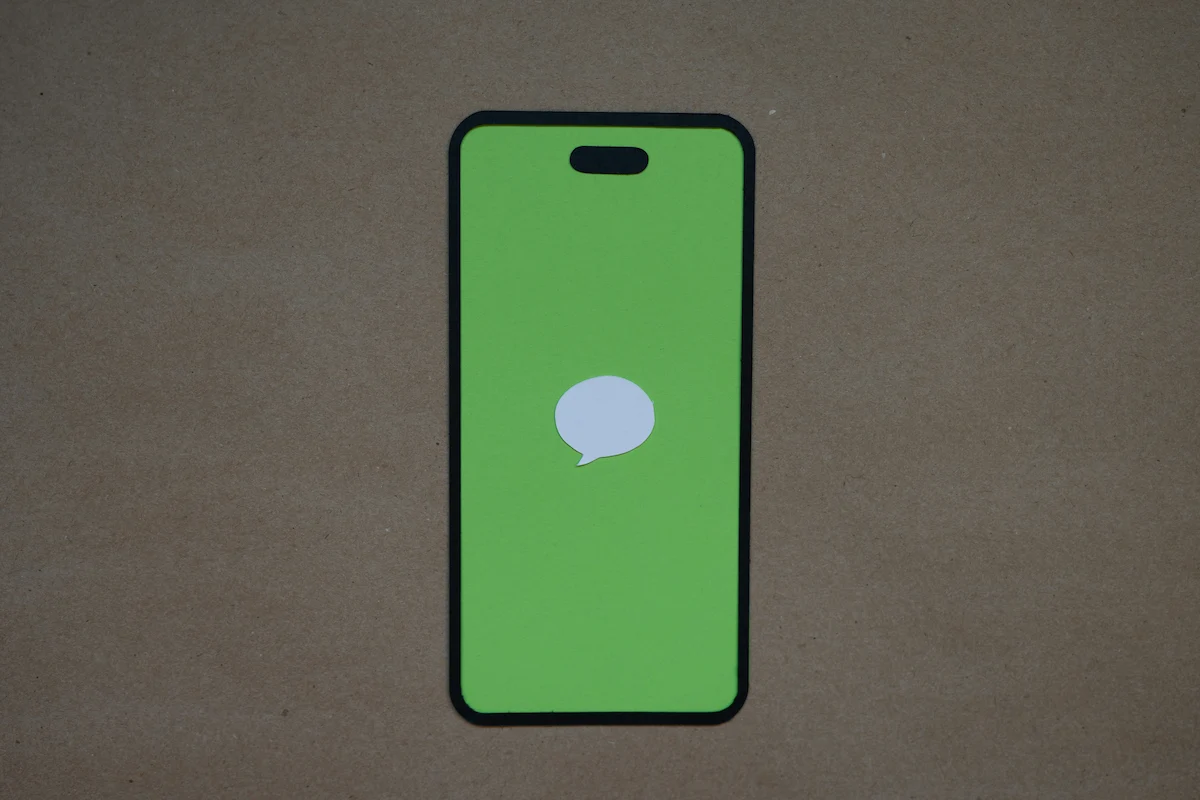
Mobile First Web Design

Designed for How People Actually Browse
Most people will visit your website from a phone, not a desktop. That’s why we don’t treat mobile as an afterthought. We start there. Mobile first design means everything we build is made to load fast, feel easy to use, and look great on the smallest screens first.
Our process keeps your site lean, clear, and focused on what really matters. No unnecessary distractions. Just a smooth experience that helps visitors get where they need to go without frustration.
Why It Works
- Better Load Times: By designing with efficiency in mind, your site loads quickly even on slow mobile connections.
- Stronger SEO: Google gives priority to websites that are built for mobile users.
- Happier Visitors: Easy navigation, clear layouts, and thumb-friendly buttons mean people stay longer and take action.
- One Site for Every Screen: Your design adapts automatically to tablets, laptops, and big desktop monitors without added complexity.
Built Around Your Business
We don’t use bloated templates or generic layouts. Each site is hand coded from scratch to highlight your services and speak directly to your customers. You get a fast, responsive site that reflects your brand and is built to grow.
Whether someone finds you during a quick search on their phone or takes a deep dive on their laptop, they’ll get a consistent, polished experience. That’s the kind of trust that turns visitors into customers.
Let's Talk